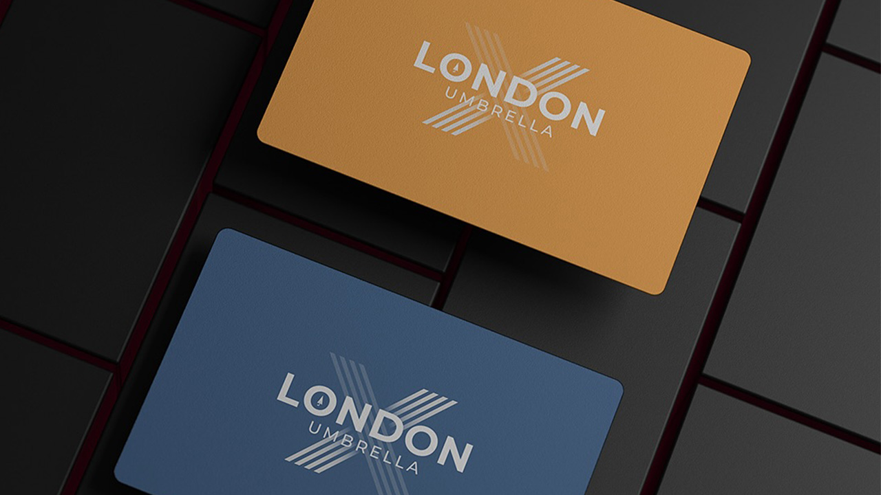

Umbrella X London partnered with Black Oak Digital to create a professional identity that reflects reliability, transparency, and modern financial solutions. The objective was to design a brand system and online presence that builds trust and communicates expertise in payroll management and compliance services. Through a clean, contemporary logo and an optimized website interface, we highlighted the brand’s commitment to simplicity and accuracy in payroll processing. Our approach ensured that every visual and functional element reinforced the values of efficiency, professionalism, and customer confidence. The social media strategy extended this presence by communicating credibility and authority within the UK’s payroll sector — helping Umbrella X London engage with businesses and professionals through targeted campaigns and consistent visual branding.
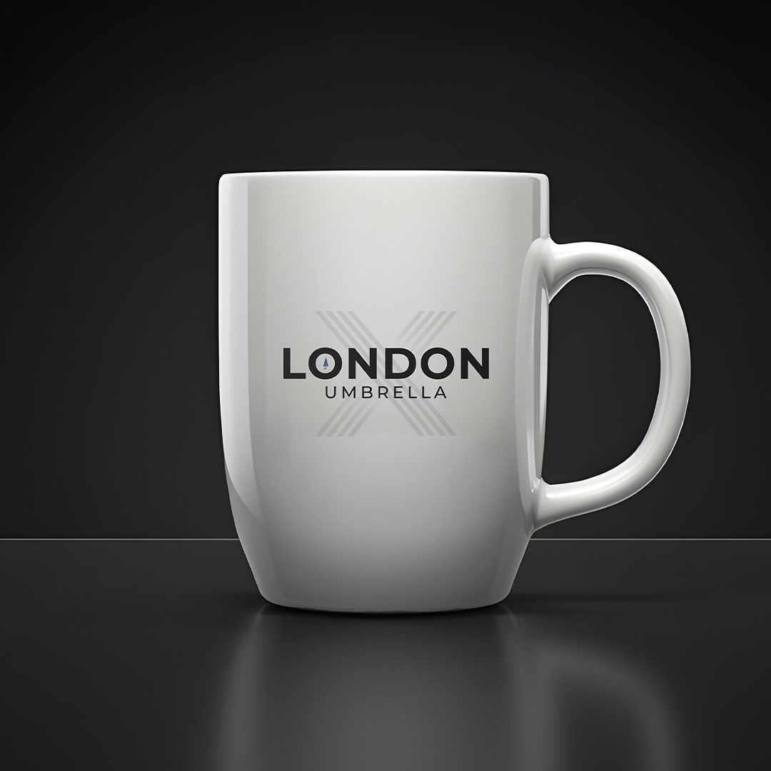
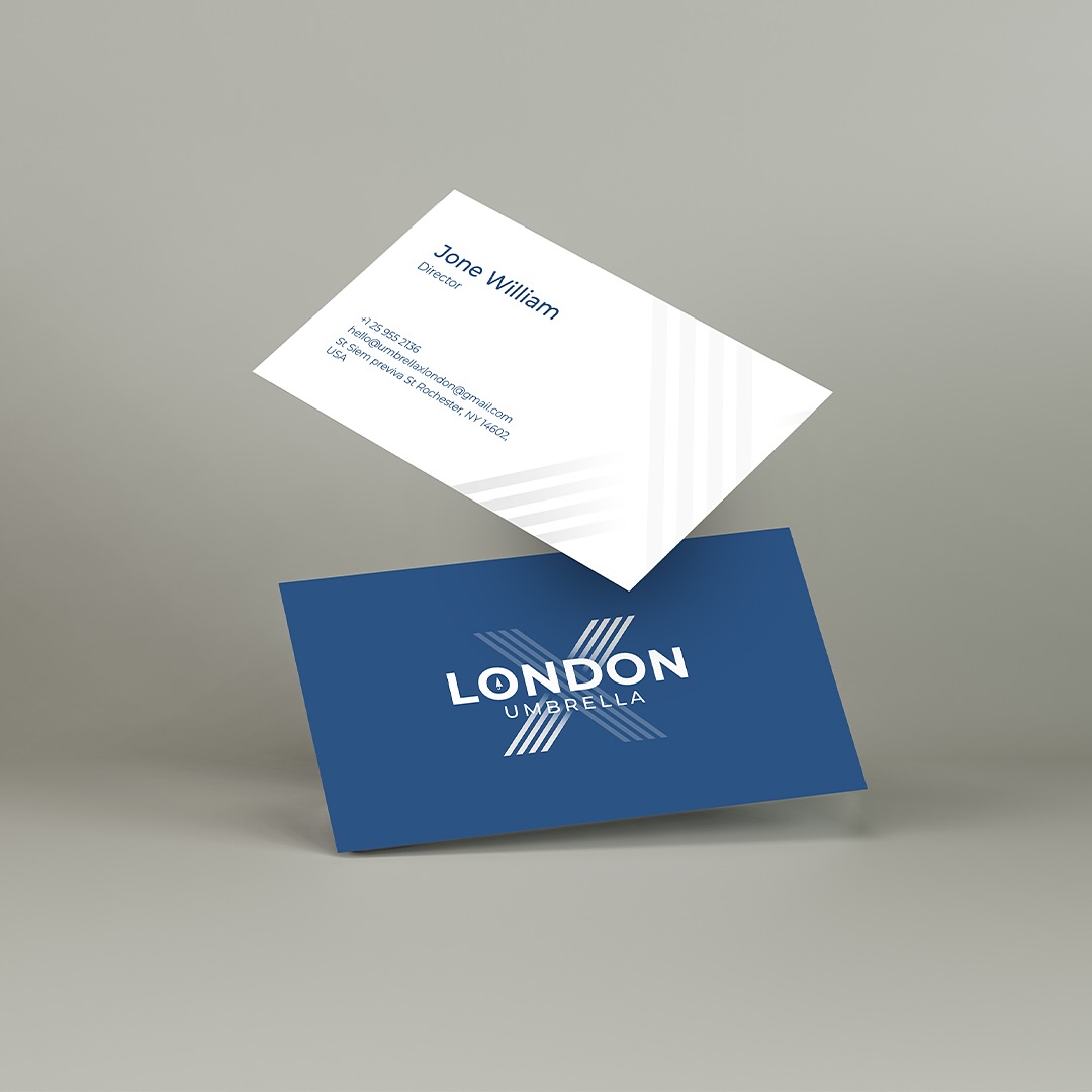



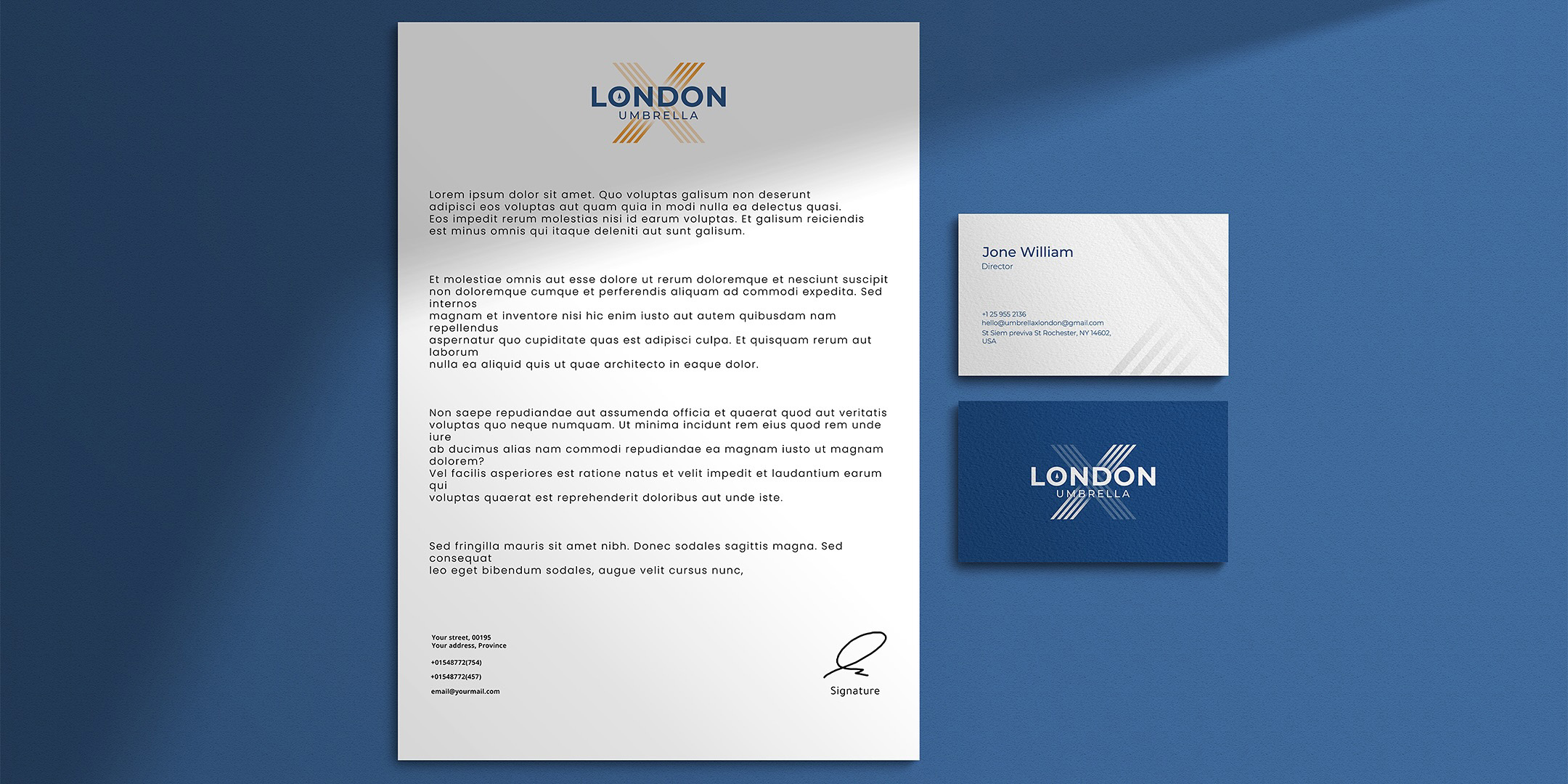
The Umbrella X London logo is designed with a structured hierarchy that communicates professionalism and stability — essential traits for a payroll services brand. The bold “X” forms the foundation, symbolizing precision and balance, while the centered placement of the wordmark “London Umbrella” projects trust and clarity. The use of alignment and spacing ensures readability and visual harmony, reflecting the brand’s focus on accuracy, dependability, and modern financial management.
The logo integrates the X as a defining mark — a symbol of connection between clients and seamless payroll solutions. The umbrella icon embedded within the typography subtly reinforces protection and reliability, two key values of the financial sector.
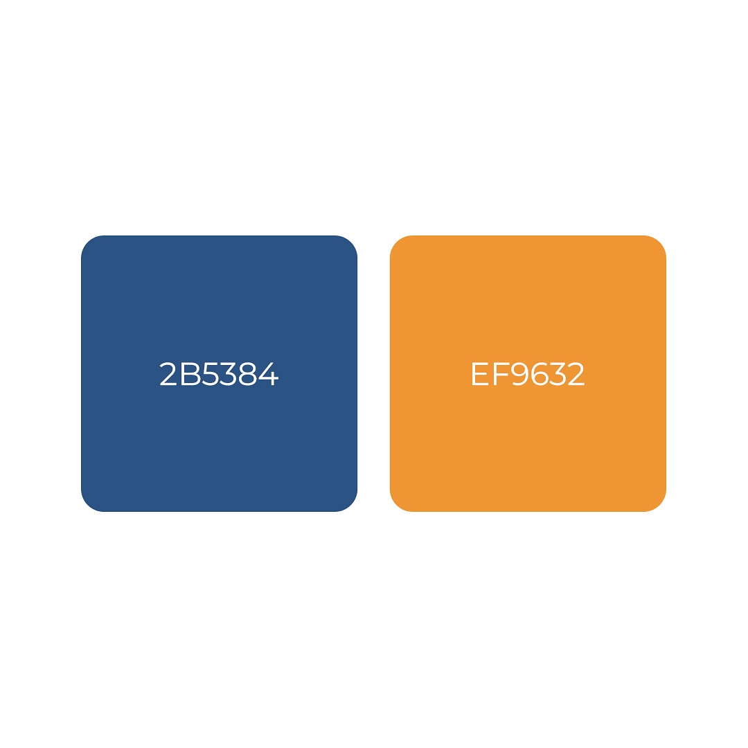
The color palette combines Royal Blue (#2B5384) and Amber Orange (#EF9632) — blue representing integrity, stability, and corporate trust, while orange adds a modern touch of energy, optimism, and approachability. The typography is clean and geometric, projecting precision and clarity that mirror the company’s dedication to transparent and efficient service delivery.
Black Oak Digital is a creative digital agency specializing in design, development, and marketing.
Founded in Pakistan, we collaborate with global clients to build bold brands, seamless websites, and performance-driven campaigns that inspire growth.
© 2026 Black Oak Digital. All rights reserved.